Sneak peek at a new look for Board Management

Jun 06
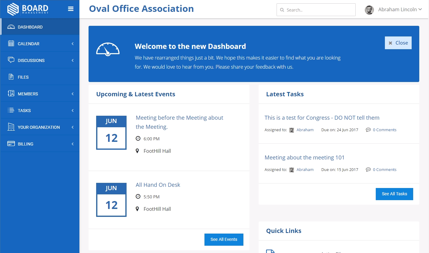
As mentioned in last month’s update, we’re getting closer to releasing a visual makeover of your BoardManagement experience. This major development has been months in the making and involved a team of usability experts and designers. Here’s a walk-through to give you a sneak peek of what your workspace will soon look like. Keep in mind that some elements may still change as polishing of the design continues.
The first change you’ll notice is the layout. Replacing the timeline with a more activity-focused update on the Dashboard. It’s much easier to go from page to another with asynchronous menu and pages throughout the site. Organization and Billing information is now accessed from the same place, and more screen space is available on laptop, desktop, and tablet screens for getting things done. The sidebar is automatically replaced with a touch-friendly menu on mobile devices and smaller screens.

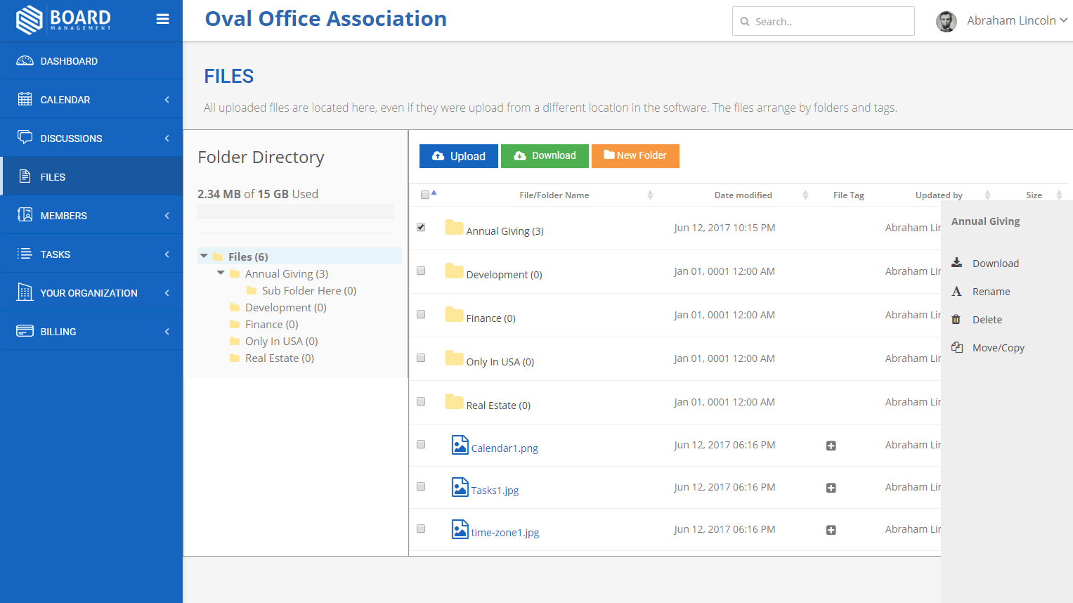
The most noticeable change in the new interface is the way you will be able to interact with document/files. With a complete rewrite of the file management feature, everything is now in one place. The new Web DocViewer allow you to access and view all type of files right from your web browser.

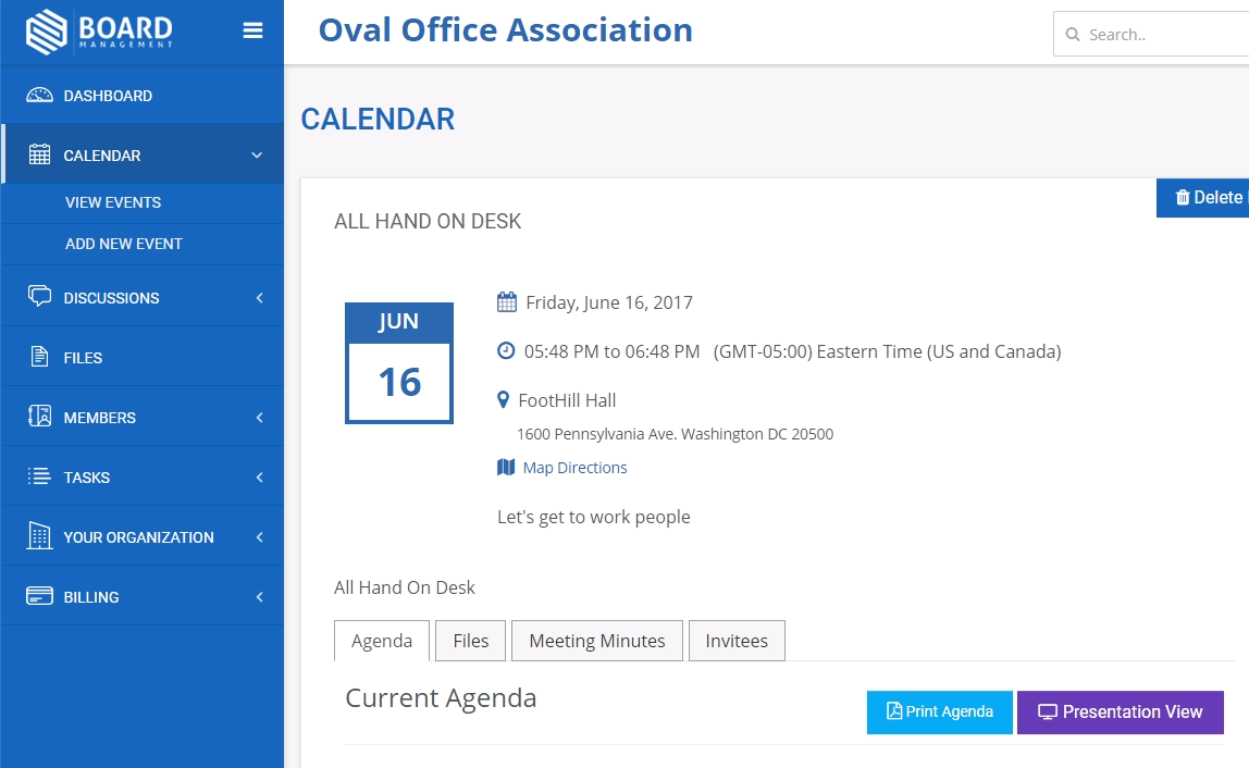
New built-in Boardbook based on Agenda items is now available on all account. The new Presentation View allows members to view all documentation related to an event or meeting at one location.

Coming soon: voting and notification digest.
In the next coming months, we will start rolling out two of the most requested features on the platform. Stay tuned!
Again, this new design will be made available for all accounts in the next week. We believe that this redesign will help you get the most out of your account and quickly get to collaboration mode with your board.
